Jay posted some great looking buttons over at Anomaly: https://blog.anomalyinnovations.com/2010/03/creating-a-realistic-looking-button-with-css3/
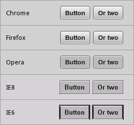
To follow on from there I have updated (hacked) the example to use CSS3 gradients instead of images. Unsupported browsers fallback to solid colour backgrounds.
I am not using these examples in the wild. They need a lot more polish before being released. Image fallback could be added back in for example. It was just to show examples of how the CSS3 gradient buttons look and function in Firefox and Chrome.
Button code:
<a class='button'><b class='o'><b class='m'><b>Button</b></b></b></a>
Results in various browsers:
Check out the example code at: http://dl.dropbox.com/u/173699/css3-buttons.html
– Karl

One Comment
nice work, how about styling for submit and reset buttons , any help, thanks