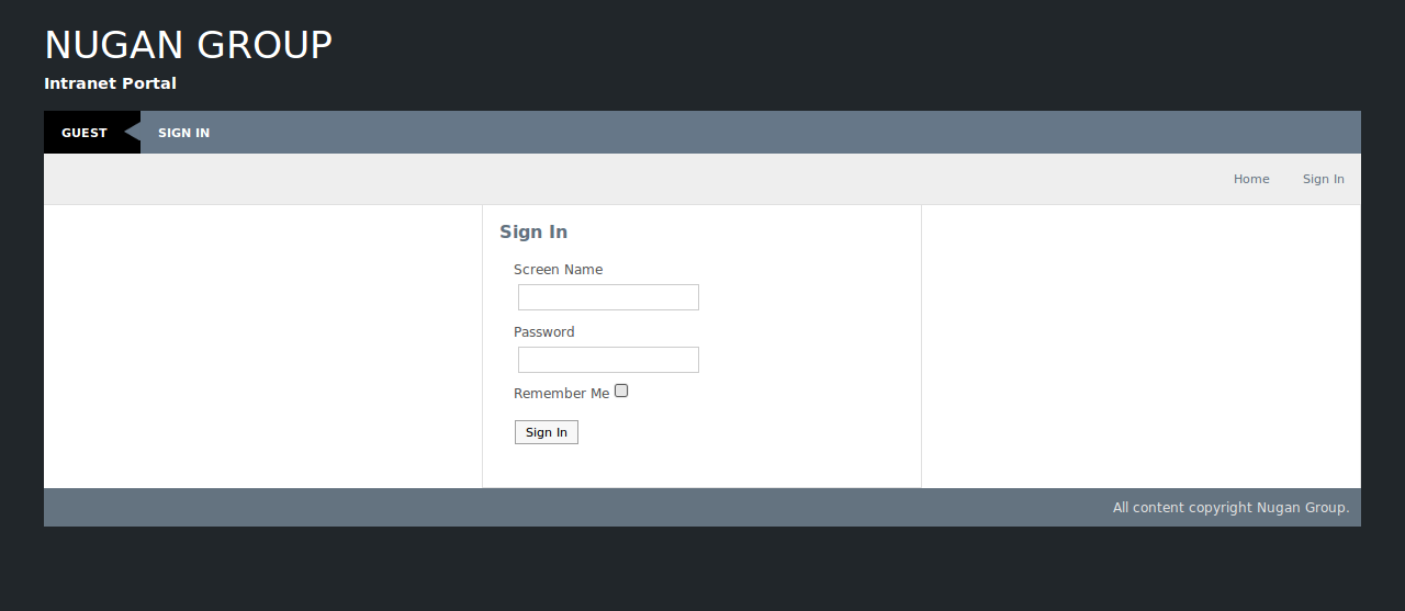
And now announcing the release of my first Liferay theme. Details about the wordpress theme it is based on is available in my previous post (Liferay Inroads).
It has made a perfect intranet theme for our uses. Most appreciated is the simplified interface look.
I have finished most visual touchups. Things left on my to do list are submenu indicators, tools menu rearrangement and rethemeing the chat portal.
If anybody has ideas on integrating the chat portal visuals closer I’d be happy to listen.
DOWNLOAD and INSTALL: The theme should now be available from the theme installer in liferay-5.2.2 installs and the WinterSky theme page on Liferay is here.
Now to work on some new portals. Till next time.

10 Comments
Alright mate, loving the theme but have you noticed on IE7 that the nav menu is rendered with a transparent background and the rollover gets confused?
Cheers
Tom
I did see it on IE7 the other day and was a bit disappointed. Not entirely shocked though. Oddly enough it looks pretty good in IE8 except for the borders around the dropdown menus disappearing.
I don’t have IE7 on any machines, so if anybody wants to contribute a patch I’ll be glad to add to the credits.
I take it back, it appears liferay is rendering the portlet titles a layer above everything else, most annoying
Hi AgentK,
thanx for the nice Liferay theme; love it and did some customizations as you can notice under http://www.pmote.com. Hope you don’t mind.
Would be glad if someone could figure out why the body div width extends the menu bars and bottom menu bars for 1 pix. Any ideas?
Changed the menu bar to omit the community name (it is always Guest for us). The menu then gets extended when you get logged in…
When will you release more WintreSky versions…?
Cheers,
Peter
Hey Peter, good work on customizing the theme. I don’t have any problems with theme adoptions or changes.
The anomaly you are seeing is a 1px column seperator border. You have two options:
Remove ‘border-right: 1px solid #E1E1E1;’ from ‘#content-wrapper .lfr-column’.
Or you could add ‘padding-right: 1px’ to ‘#content-wrapper’.
I don’t think I can make either of those changes in the uploaded version without an equally opposite consequence.
And any suggestions for other theme versions? The uploaded version already has blue (winter), red, orange and gray variations.
– Karl
It looks pretty!!!!
But it doesn’t work on IE6, it seems the same problem for IE7 here…
Yes, it is even worse on IE6 than it is on IE7. If anybody can contribute patches to correct IE functionality it would be much appreciated as I don’t have access to IE6&7.
– Karl
I want to learn setp-by-step liferay themes development. Do you know, where can I read those tutorials?
magee
For tutorials I read all the information I could find when I did a search for Themes and SDK in the Liferay wiki. For themes the wiki was fairly complete and there was not much extra the Liferay Portal 5.2 Systems Development book covered about themes that the wiki did not. But if you want to know a lot more about Liferay I would recommend the book.
– Karl
Hi AgentK,
Your theme is lovely. I just downloaded it and i’m currently about to use it for one of my projects. Thanks.
Hello Peter,
I love your modification. Is it possible that i can get it from you, as I also need some of your modifications i.e making the company logo show up, removal of the community name on the menu bar and its look on ie6. Hope to hear from you soon. Thanks.