Feeling inspired by the Chris Coyier article on triangle breadcrumbs (http://css-tricks.com/triangle-breadcrumbs/) I could see lots of potential for the css triangles.
I’ve lately been a sucker for the power of css, and trying to limit the number of images used. So lets get started at building the tooltips without a single image.
HTML
We’ll build a form with popup help descriptions that appear when you mouse over or focus a field. I have not thought about how else to apply this technique, but I’d love to hear how you have adopted it.
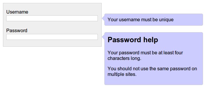
We will start with a form definition, with a username and password fields. You could use a horizontal menu navigation with tooltip descriptions.
Step 1: Accessible form
<form>
    <ul>
        <li>
            <label for='#username'>Username</label>
            <input type='text' id='username' name='username'/>
            <span class='help_text' id='username_help_text'>
                Your username must be unique
            </span>
        </li>
        <li>
            <label for='#password'>Password</label>
            <input type='password' id='password' name='password'/>
            <span class='help_text' id='password_help_text'>
                <h2>Password help</h4>
                <p>Your password must be at least four characters long.</p>
                <p>You should not use the same password on multiple sites.</p>
            </span>
        </li>
    </ul>
</form>
So far we have a plain form. It’s a perfect start to an accessible form. The help text’s are wrapped in a class identified span this can be whatever you want as long as it’s able to be addressed in css. The spans here work well with the Django output I am using. The id’s on the spans are just there to give us more options with javascript later.
There are two field help texts, the first is a plain text that fits beside the field, the second example being a much more verbose description with heading and paragraphs.
CSS
Step 2: Form styling
[sourcecode language=”css” wraplines=”false”]
body {
font-family: arial, sans;
}
input[type=”text”],
input[type=”password”] {
border: 1px solid #ccc;
}
ul {
width: 310px;
list-style: none;
margin: 0;
padding: 10px;
border: 1px solid #ccc;
background: #efefef;
}
li {
padding: 10px 0;
margin: 0;
}
label, input {
display: block;
width: 99%;
}
[/sourcecode]
Step 3: Help text styling
[sourcecode language=”css”]
.help_text {
-webkit-border-radius: 5px;
-moz-border-radius: 5px;
border-radius: 5px;
border: 1px solid #ccc;
background: #ccf;
padding: 10px;
display: block;
}
.help_text h2 {
margin-top: 0;
}
[/sourcecode]
Now comes the more interesting styling. The help text gets rounded borders where supported, plus a little bit of padding and colour.
Step 4: Callout positioning
[sourcecode language=”css” highlight=”2,15,16,17,18,19″]
li {
position: relative;
padding: 10px 0;
margin: 0;
}
.help_text {
-webkit-border-radius: 5px;
-moz-border-radius: 5px;
border-radius: 5px;
border: 1px solid #ccc;
background: #ccf;
padding: 10px;
display: block;
position: absolute;
top: 25px;
left: 100%;
width: 310px;
margin-left: 20px;
}
[/sourcecode]
To position the help text to the right we use absolute positioning. To make the left: 100% work we need to make the parent element (li) relative. Then we just use margins to offset from there. If you create a larger triangle later on then the margin-left can be adjusted here to correct the positioning.
Step 5: Callout triangles
[sourcecode language=”css”]
.help_text:before,
.help_text:after {
content: ”;
position: absolute;
width: 0;
height: 0;
top: 5px;
border-top: 10px solid transparent;
border-bottom: 10px solid transparent;
}
.help_text:before {
left: -10px;
border-right: 10px solid #ccc;
}
.help_text:after {
left: -9px;
border-right: 10px solid #ccf;
}
[/sourcecode]
Two triangles are created, one ‘before’ using the background colour and one ‘after’ using the foreground colour. This gives us the illusion of an outlined triangle. The triangles are placed offset relative to the parent. So once the triangle size is adjusted the position will need to be tweaked again to look correct.
Step 6: Hidden until needed
[sourcecode language=”css” highlight=”15,17,18,19,20,21,22″]
.help_text {
-webkit-border-radius: 5px;
-moz-border-radius: 5px;
border-radius: 5px;
border: 1px solid #ccc;
background: #ccf;
padding: 10px;
display: block;
position: absolute;
top: 25px;
left: 100%;
width: 310px;
margin-left: 20px;
display: none;
}
li:hover .help_text {
display: block;
}
input:focus + .help_text {
display: block;
}
[/sourcecode]
Ad the final css is for hiding the callouts until needed. The demo includes two examples of how to achieve this and there are boundless more ways of doing it. The li.hover will display the callout when the mouse is over the field section, and the input:focus displays the callout when the field is focused. The input:focus will only work if the .help_text is directly after the input field.
Compatibility
Compatibility is left as an exercise to the reader. When this type of progressive enhancement is used in production I’m happy to accommodate the ‘bling’ only for browsers that support it (think rounded corners and triangles using before/after) as the ‘bling’ is only for enhancement and the site’s usability is not reduced without it.
IE6
IE6 is about the only consideration that may be needed depending on your audience.
IE6 does not support the hover selector, but that can be handled by using a shim or javascript, and it does not support the before and after selectors. The help is still clearly identifiable without the triangle, but for consistency can be done by either adding more tags for the triangles either on the server side or by javascript and styling the extra tags,
One Comment
woww, it’s a great tutorial
thanks